Progressive Neuro Therapy
Building a medtech platform to include a data-driven fintech experience for its investors.
Building a medtech platform to include a data-driven fintech experience for its investors.

A medical technology company developing non-invasive neurological therapies was entering a critical stage of growth, but its website no longer reflected the sophistication of the product or the level of transparency expected by investors. I reframed the redesign as an information-access problem, restructuring the experience around audience needs, live data, and reusable patterns. The result was a clear, more credible platform that supported ongoing updates as the company’s story evolved.
Important investor info was distributed across data-heavy pages
Financial data lacked a centralized destination
Navigation didn't reflect needs of stakeholder audiences
Existing structure was difficult to extend for new information
DISCOVERY
The existing website contained extensive corporate, clinical, and financial information, but the structure made important content difficult to locate.
Investors needed quick access to quarterly results, stock performance, press releases, and clinical developments without unrelated material.
The experience needed to balance technical accuracy and transparency with clarity for investors, clinicians, partners, and the public.
PLANNING
I began by mapping the information needs and likely journeys of three primary audiences.

Investors


Clinicians

Prospective Partners

The architecture was reorganized around their specific needs, creating clearer paths to product information, financial updates, clinical developments, and company news. This established a stronger foundation for both immediate content and future additions.
The system was structured around the questions each audience was most likely to bring to the experience.
Investors needed financial and market information, clinicians and partners needed a clearer understanding of the product, supporting research, and company progress.
A modular content structure allowed these needs to coexist without forcing every visitor through the same information sequence.
Defined the primary audiences and their information priorities
Reorganized content into clearer and more predictable categories
Established a hierarchy for financial, clinical, and product information
Created a modular foundation for future updates and functionality
Content paths were reconstructed to move visitors from general understanding to detailed information without unnecessary searching. High-priority information was surfaced earlier, while deeper financial and clinical material remained available within a consistent structure.
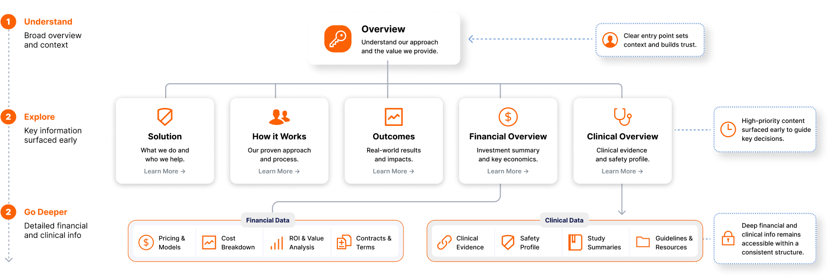
Organized the experience around audience questions and intent
Prioritized important updates without overwhelming the interface
Created clearer paths between product, clinical, and financial content
Used visual hierarchy to distinguish summaries from detailed information
IMPLEMENTATION
The responsive interface was designed in Figma using a component-based structure and a flexible grid system. Reusable elements helped maintain consistency while allowing financial data, product information, and editorial content to be presented in formats appropriate to each section.
A 12-column desktop grid, 8-column tablet grid, and 4-column mobile grid established predictable relationships between text, data, imagery, and interactive content across screen sizes.
Figma was used to develop responsive layouts, reusable interface patterns, and representative prototypes.
The system standardized typography, spacing, navigation, content modules, and data presentation. This gave the experience a consistent visual language while reducing the need to design every new page or update independently.
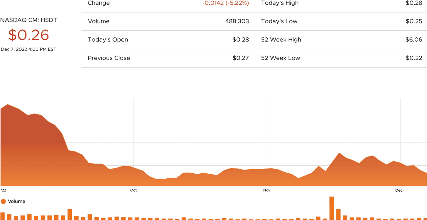
I worked with engineering to integrate real-time API data streams for stock and press updates, ensuring accuracy while keeping performance in mind. The system was designed to be maintainable and future-ready, supporting additional functionality such as dashboards and clinical timelines.
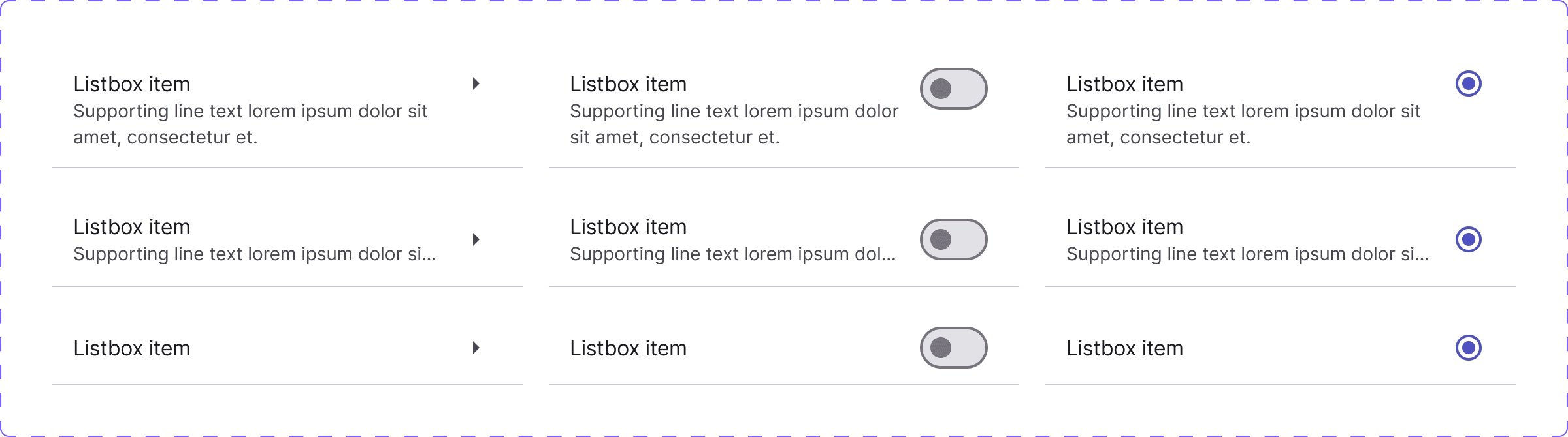
Connected information architecture with a reusable interface system
Reduced inconsistency through shared components and layout rules
Supported responsive behavior across desktop, tablet, and mobile
Created a maintainable foundation for future content and features
OUTCOME
The completed system gave the company a more coherent foundation for presenting financial, clinical, and product information. Reusable components and responsive layout rules made the site easier to update while creating a more consistent experience for visitors moving between different types of content.

Desktop Structure
A 12-column grid supported detailed layouts, market information, editorial content, and data presentations.

Tablet Structure
An 8-column grid preserved hierarchy while adapting content relationships for intermediate screen sizes.

Mobile Structure
Mobile Structure A 4-column grid converted layouts into focused, content that remained readable on smaller screens.
The revised architecture created clearer paths for investors, clinicians, prospective partners, and the public. Rather than treating every visitor as though they had the same priorities, the experience allowed important information to be discovered through more relevant entry points.
Financial information and stock performance received greater visibility for investors, while clinical and product content provided context around the technology and its development.
This organization helped the company communicate both technical progress and business information within one connected experience.

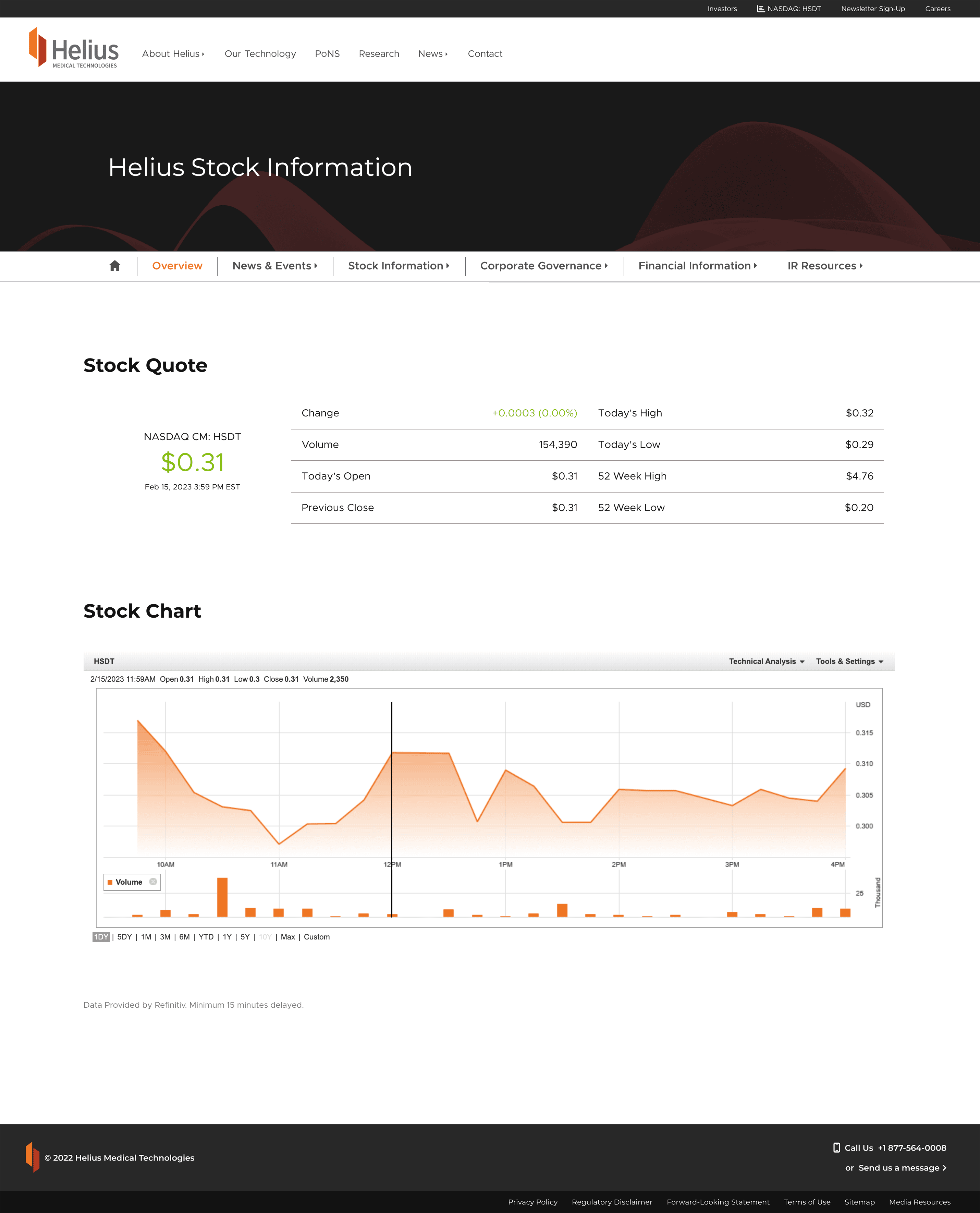
Shifted the experience from a static to a responsive information platform
Made important financial and product information easier to locate
Introduced live data while preserving clarity and visual consistency
Created flexible layouts that could evolve with the company
REFLECTING
The redesign transformed a content-heavy corporate website into a more structured platform for investor and stakeholder communication. Clearer navigation, stronger hierarchy, and centralized access to important information gave visitors a more understandable view of the company’s product and progress.
The responsive grid and component system also made the experience easier to extend. New financial updates, clinical information, press announcements, and product content could be incorporated without weakening the overall structure.
The project reinforced that credibility in a technical and regulated environment is created through more than visual refinement. It depends on clear information, current data, predictable interactions, and an experience that helps visitors feel confident in what they are seeing. If I extended the work today, I would establish baseline analytics and conduct task-based testing with investors to measure findability, comprehension, and confidence more directly.
Clarified the information journey for investors and stakeholders
Centralized access to financial, clinical, and product information
Improved navigation across content-heavy areas of the experience
Integrated current stock and press information through live data
Established responsive standards across desktop, tablet, and mobile
Created a reusable foundation for future content and functionality