Rapid Procedural Guidance
Designing a native medtech experience to deliver fast, step-by-step guidance for critical vascular access procedures.
Designing a native medtech experience to deliver fast, step-by-step guidance for critical vascular access procedures.
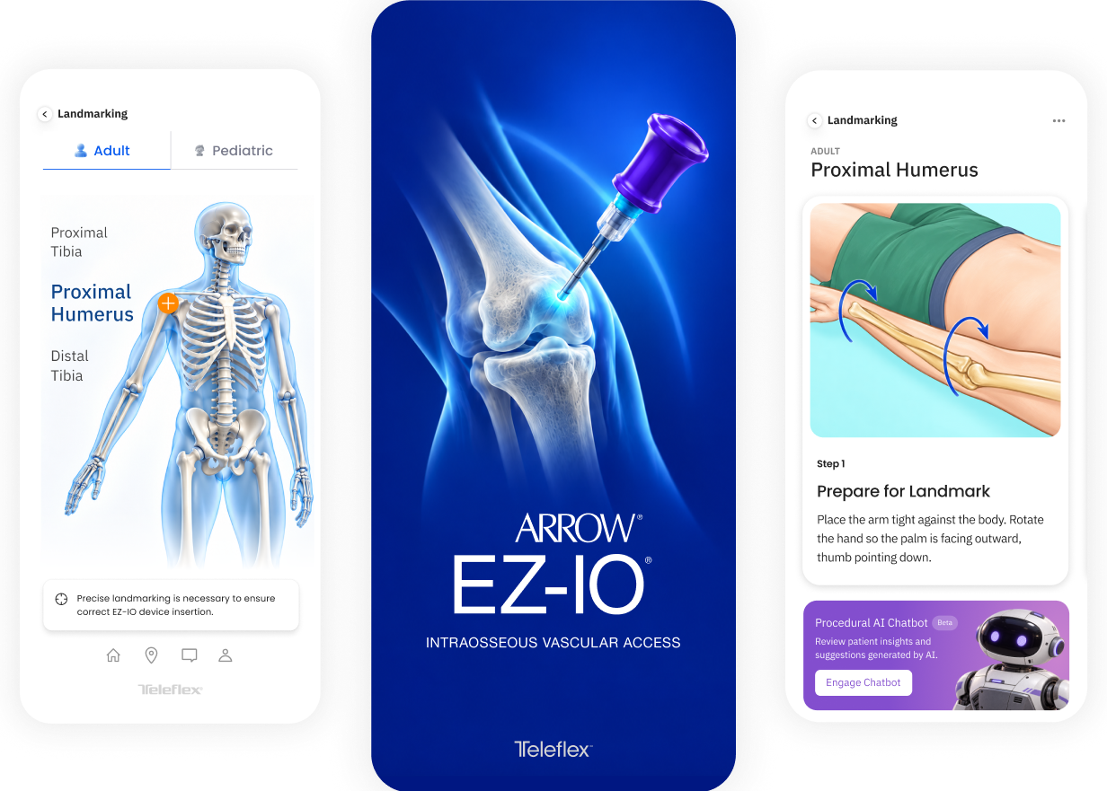
EZ-IO is used in time-sensitive medical scenarios where speed and accuracy are critical. The product needed to balance clinical precision with usability so that essential information could be accessed quickly without introducing unnecessary cognitive load.
The design approach centered on simplifying complex medical content into structured, actionable flows that support real-world use in emergency conditions.
The primary challenge was designing for a context where users have limited time, attention, and margin for error. The experience needed to accommodate dense and highly technical information while remaining clear and easy to navigate. It also had to function effectively in high-stress environments where hesitation or confusion could impact outcomes. The product ultimately needed to serve as both a reference tool and a decision-support system without overwhelming the user.
Senior UX Design Consultant
End-to-End Product Design
Design System Foundation
Workflow Architecture
Multi-User Interfaces
The project began with defining the core use cases and identifying the most critical user paths. Early efforts focused on understanding how clinicians access and use procedural information, identifying the moments where clarity and speed are most important, and establishing a structure that supports quick scanning and decision-making. This phase created the foundation for a system that prioritizes usability under pressure.
INTERACTION ARCHITECTURE
The app needed to deliver procedural guidance quickly without flattening the clinical differences between adult and pediatric use. I organized the experience around a shared navigation model with context-specific paths, allowing users to orient quickly and reveal detail only when it became relevant.
PROGRESSIVE DISCLOSURE
Procedural information was broken into clear steps so users could focus on the task without competing information.
CONTEXT-AWARE PATHS
Adult and pediatric selections directed users into the appropriate techniques, insertion sites, and supporting guidance.
CONSISTENT NAVIGATION
Shared interaction patterns kept procedural steps, videos, and product information predictable across both modes.
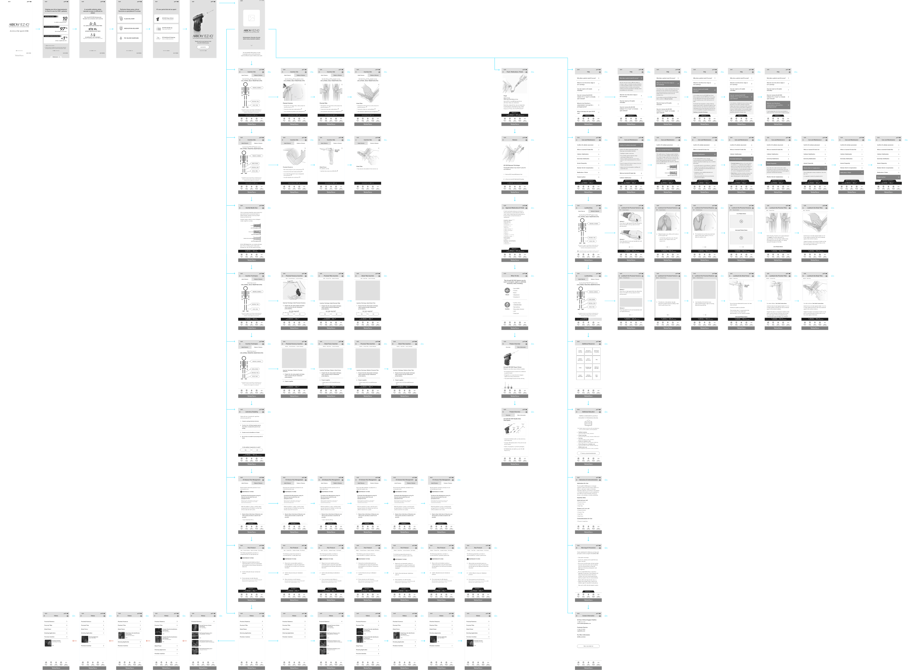
The wireframes mapped the complete application and established how a shared structure could support distinct adult and pediatric workflows without fragmenting the experience. A mode-selection step at launch established patient context first. From there, the interface could adapt procedural content while preserving the same navigation, hierarchy, and interaction model throughout the app.
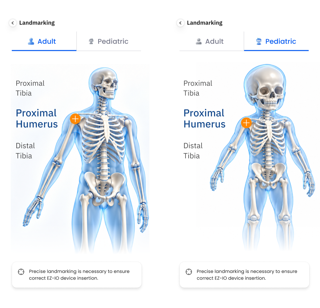
The classification of the system varies between two types of patients, adult and pediatric. These two patient types required a careful separation of differing content within several shared categories. For example, both adult and pediatric patient could recieve a needle insertion into the proximal humerus, but the techniques were vastly different. This led to the design of a modal approach to the situation based on the user first selecting the patient classification, then which insertion site they should target.
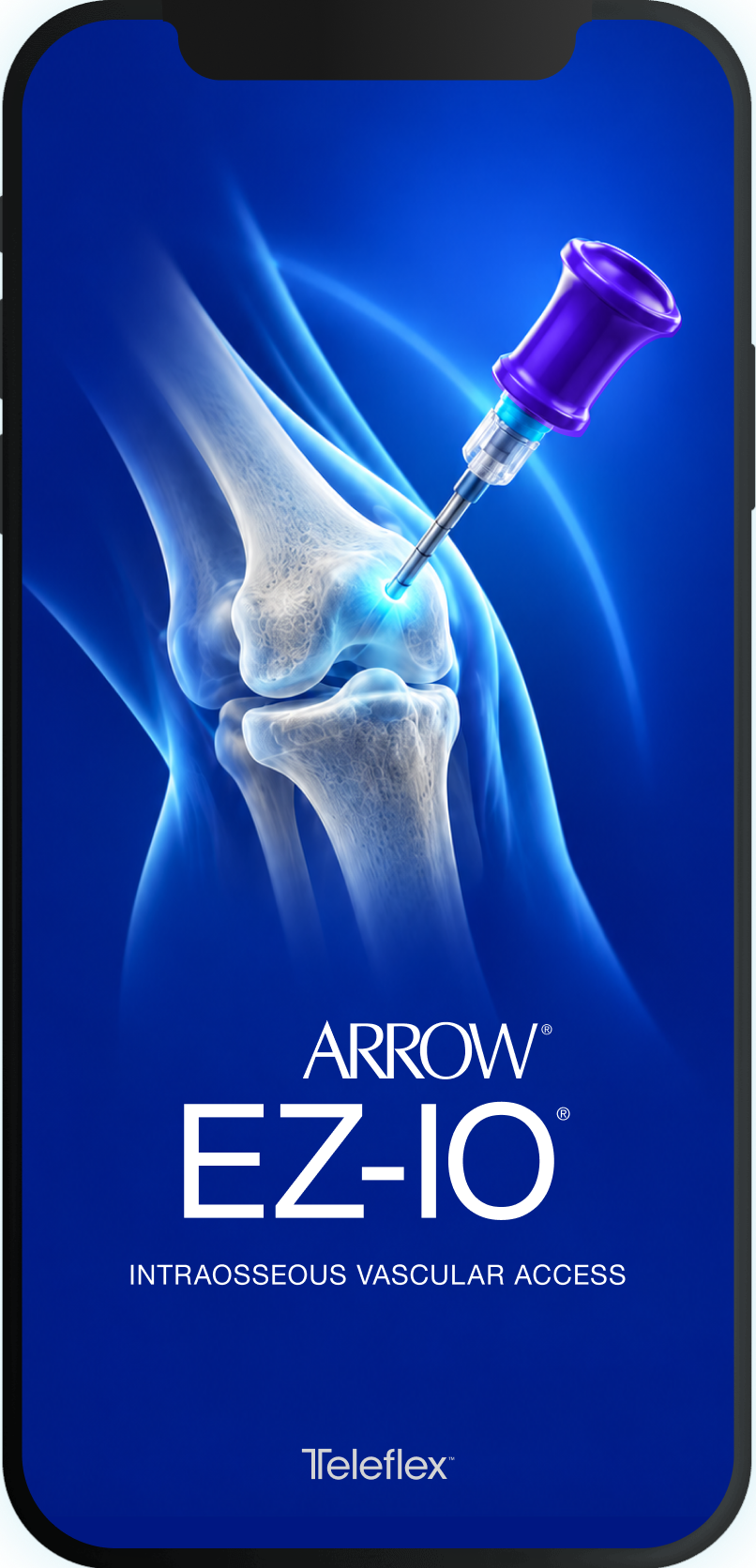
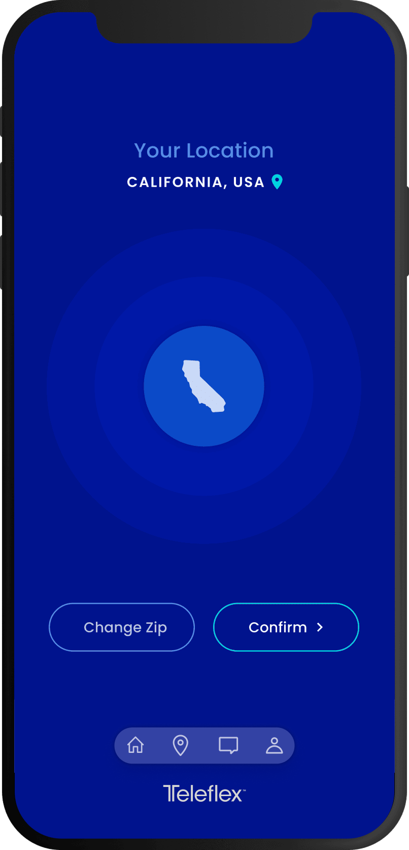
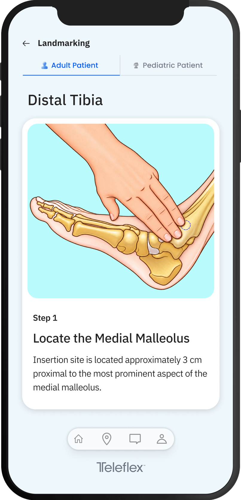
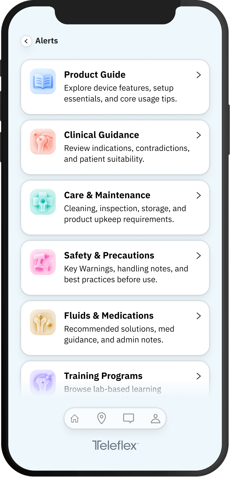
The delivered app concept gave Teleflex a polished, interactive reference tool to accompany the product launch. Rather than relying on bulky printed materials, presenters and clinicians could use the app to demonstrate, explore, and reference instructional and marketing data in real time. The modular system supports future content extension including clinical updates, new insertion techniques, or enhanced media assets, without needing a full on redesign.
Working on EZ-IO reinforced how critical clarity is when lives are involved: every decision must help reduce ambiguity, not add to it. The design challenge was not just visual polish, but balancing trust, accessibility, and technical complexity in a way that feels seamless to a user in urgency. In the future, I’d further validate procedural flows via simulation testing and explore richer feedback cues (e.g. haptics or microanimations) to reinforce confidence during critical steps.