 Elicker
Overview
Questis is a wealth-management agency positioning itself as a challenger to conventional financial firms. Their goal was to introduce three flagship products—Advice, Invest, and Academy—while reinforcing a sense of validation, approachability, and modern financial confidence. My work included branding each product, designing custom illustrations, defining content strategy, and executing the full UX / UI redesign to bring a new digital presence to life.
Challenge
Questis needed a visual and structural identity that feels empathetic but confident, mixing human warmth and financial credibility. The site also had to balance content complexity (product descriptions, calculators, testimonials) with intuitive clarity. Each product brand had to feel distinct yet coherent within the overall identity. In addition, users skeptical about investing needed a way to explore without feeling overwhelmed or excluded.
Role
Branding
Illustration
Content Strategy
Information Architecture
Wireframing
UI/UX
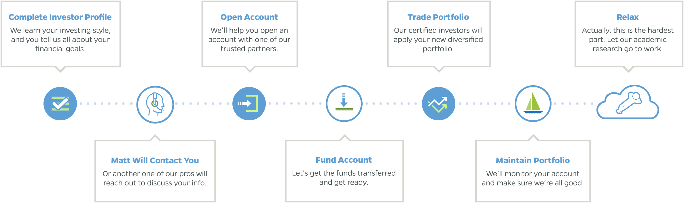
I began by defining a voice and visual tone rooted in friendly authority, like a neighbor who happens to be a trusted financial guide. Then I sketched multiple site structures, iterating wireframes that placed bold messaging and testimonials early to establish trust. The information architecture separated philosophy, features, team bios, FAQs, and pricing, with clear CTAs throughout. Custom illustrations and a bespoke investment widget added personality: users could input basic figures to get a ballpark projection that engaged them without promising precision.
Wireframing
Several iterations included bold messaging and professional testimonials, validating the content’s rogue approach.
Wireframe sections include:
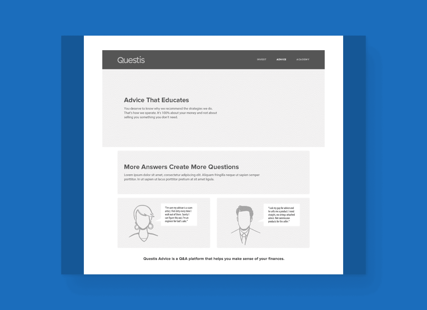
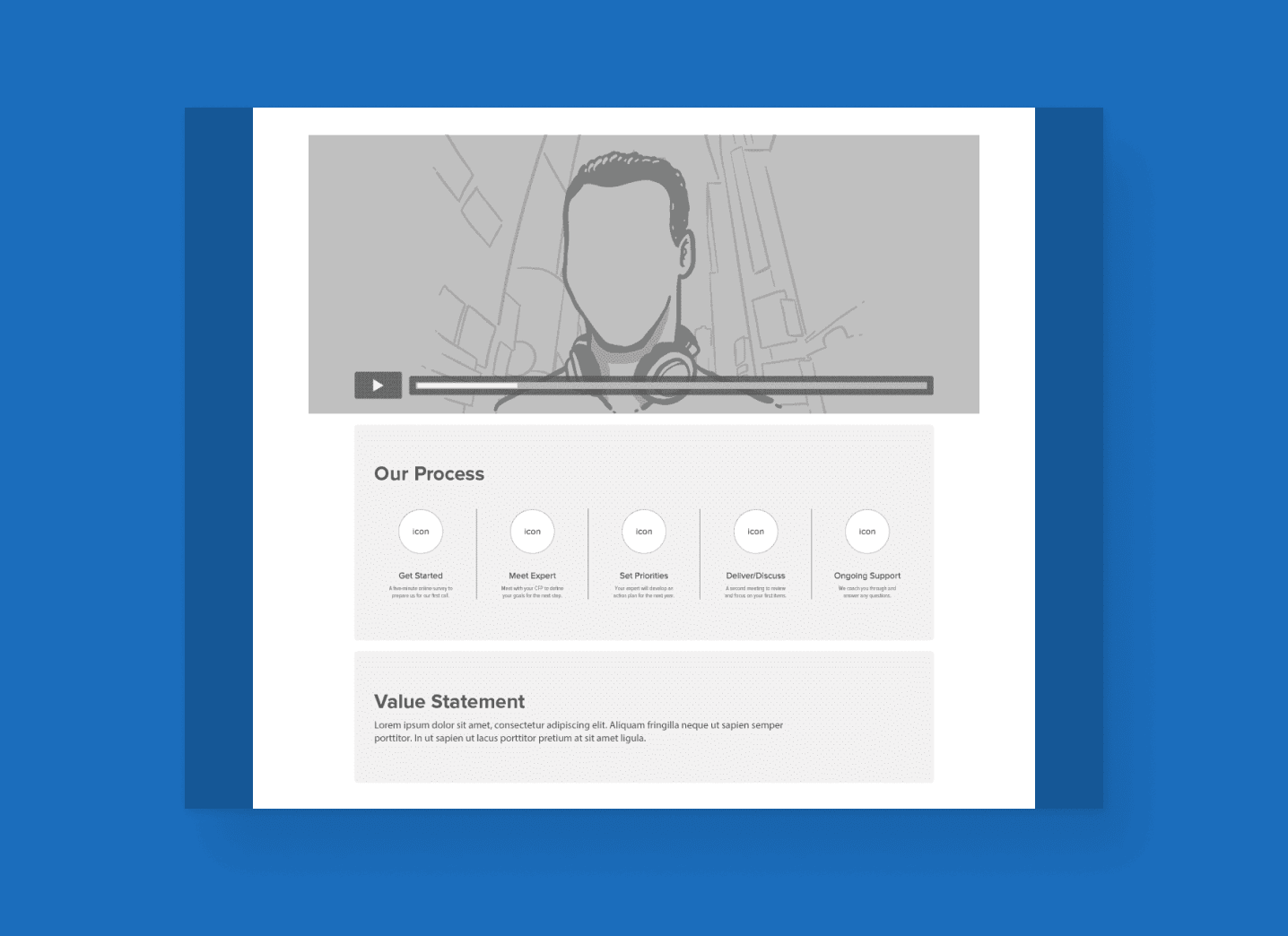
The explanation of the company philosophy and the benefits that come with a Questis partnership.
A value statement, framing the cost perspective through everyday analogies.
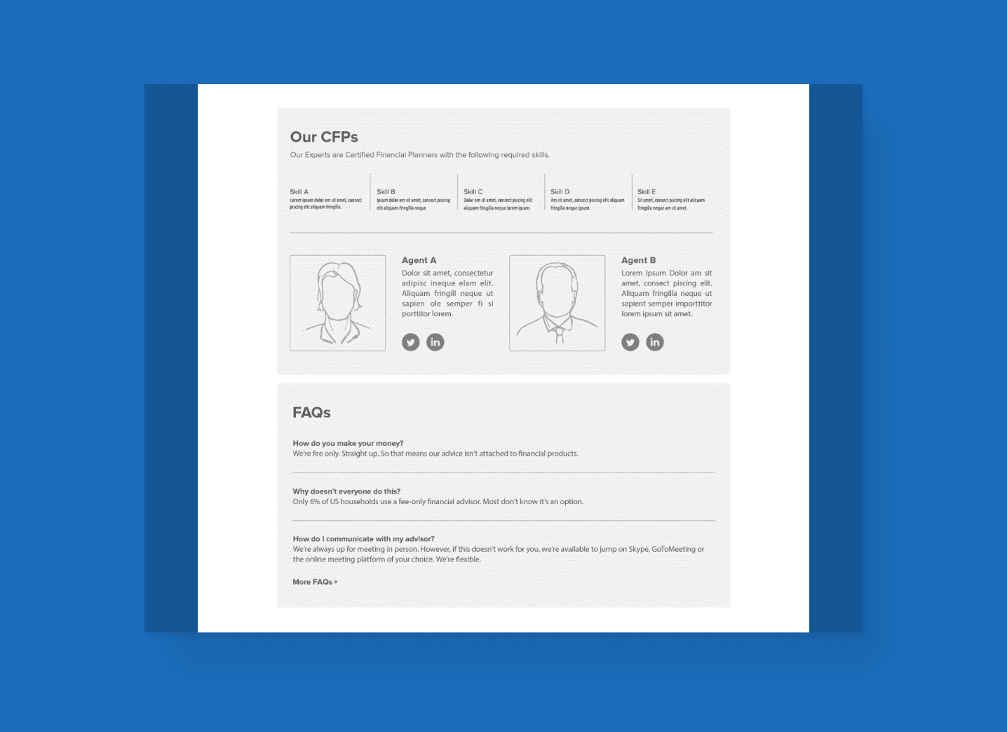
An introduction to the team with bios and contact infomation.
Some frequently asked questions for the skeptical and/or uninformed.
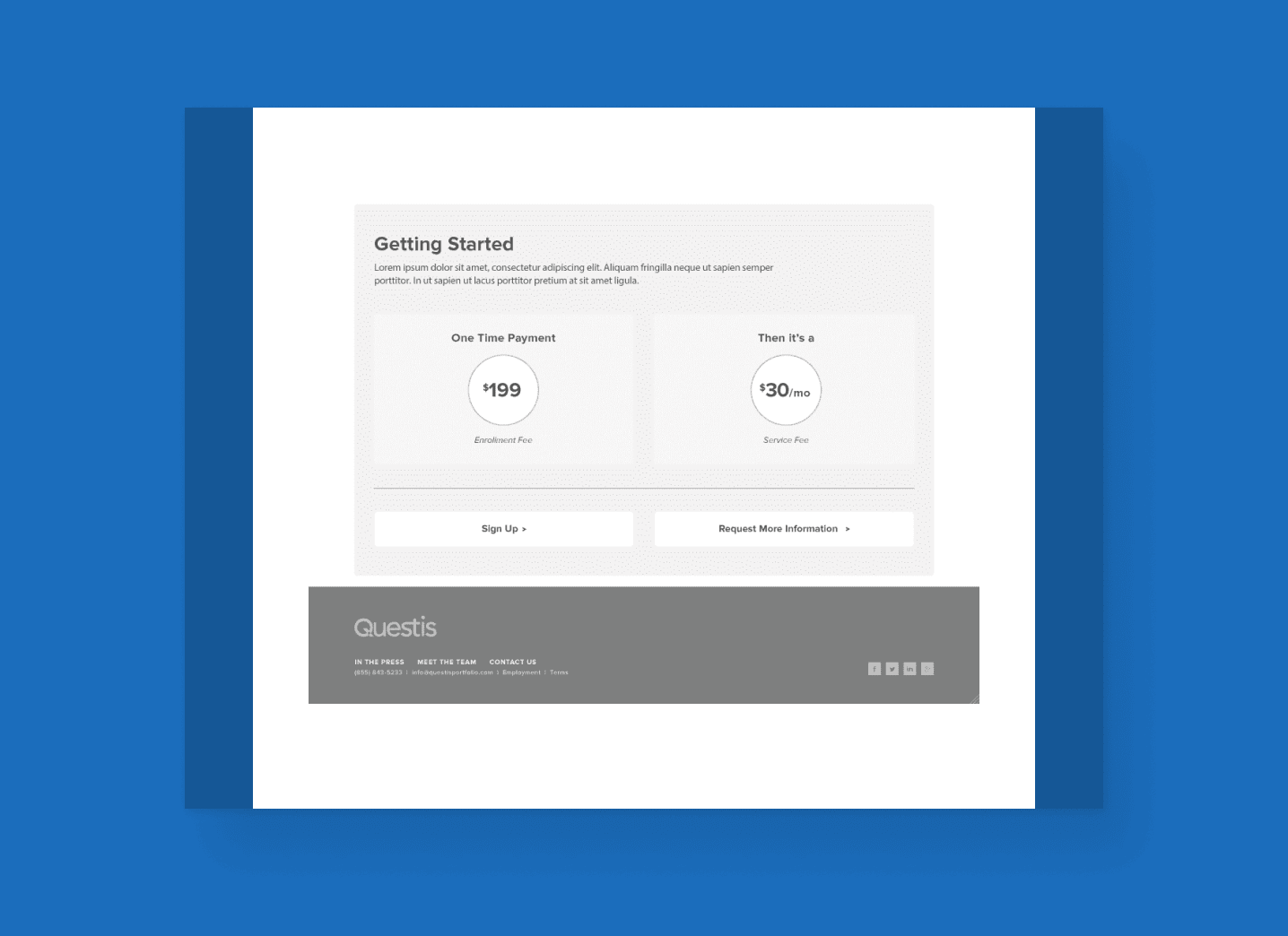
A simple pricing table breaking down partnership investment.
Essential calls to action, facilitating a purchase or further engagment.


Product Logo Design
Process Graphic
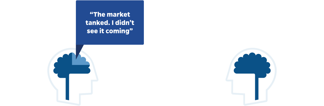
Persona Callout Illustration
“common investing misconceptions”
5 years
$250,000
Total fees
Questis
$0
Competitors
$0
Our fees will save you
$0
How is this calculated?
This simplified model estimates long-term investment growth and compares advisory fee structures over time. Results provide a directional estimate rather than a precise financial quote.

Investment Calculation Widget
Outcome & Retrospection
The new site delivered a platform where visitors can meaningfully engage with the firm’s offerings. The visual identity and site architecture brought clarity to product differences while preserving unity. The investment widget invites exploration and frames financial tools accessibly. The combination of structure, story, and design-elevated brand perceptions, making the site a strong conversion driver and trust builder for new clients.
This project reaffirmed for me how vital brand voice is, especially in financial services, where trust is everything. Balancing personality and precision challenged me to design systems and flows that felt expressive without losing clarity. If I revisited this project, I’d further test how users move between the three product streams and refine cross-product transitions, ensuring users always stay grounded in a coherent narrative.