 Elicker
Overview
A medical technology company developing non-invasive neurological therapies was entering a critical phase of growth and investor engagement, but its website no longer reflected the sophistication of its product or the transparency expected by stakeholders. My role was to reimagine the investor experience from the ground up, transforming a static marketing site into an interactive communication platform for investors, partners, and the public.
Client
Helius Medical Technology
My Role
Information Architecture
Wireframing
UI/UX
Digital Design
The Challenge
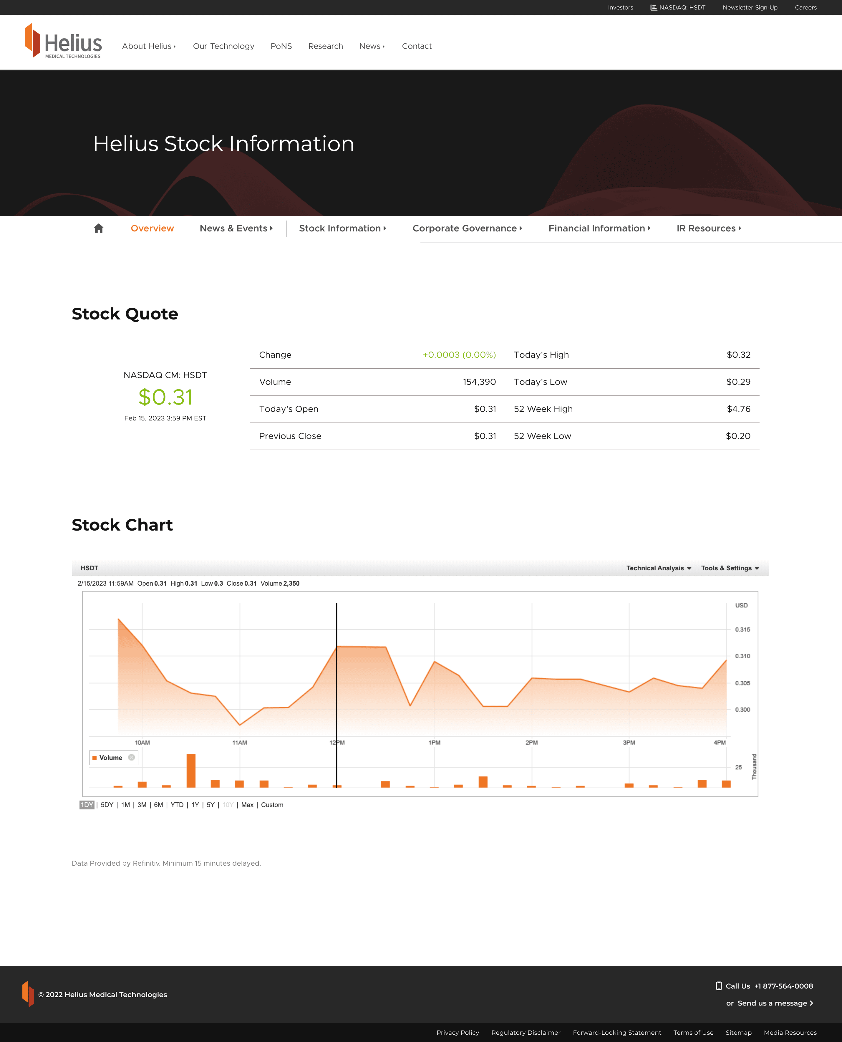
The existing website was content-heavy, difficult to navigate, and lacked a centralized view of key financial and market information. Investors needed faster access to quarterly data, stock performance, and clinical updates, while the marketing team wanted a flexible system that could evolve with the company’s roadmap. The challenge was to design a solution that balanced technical accuracy, real-time data integration, and visual simplicity without overwhelming the audience.
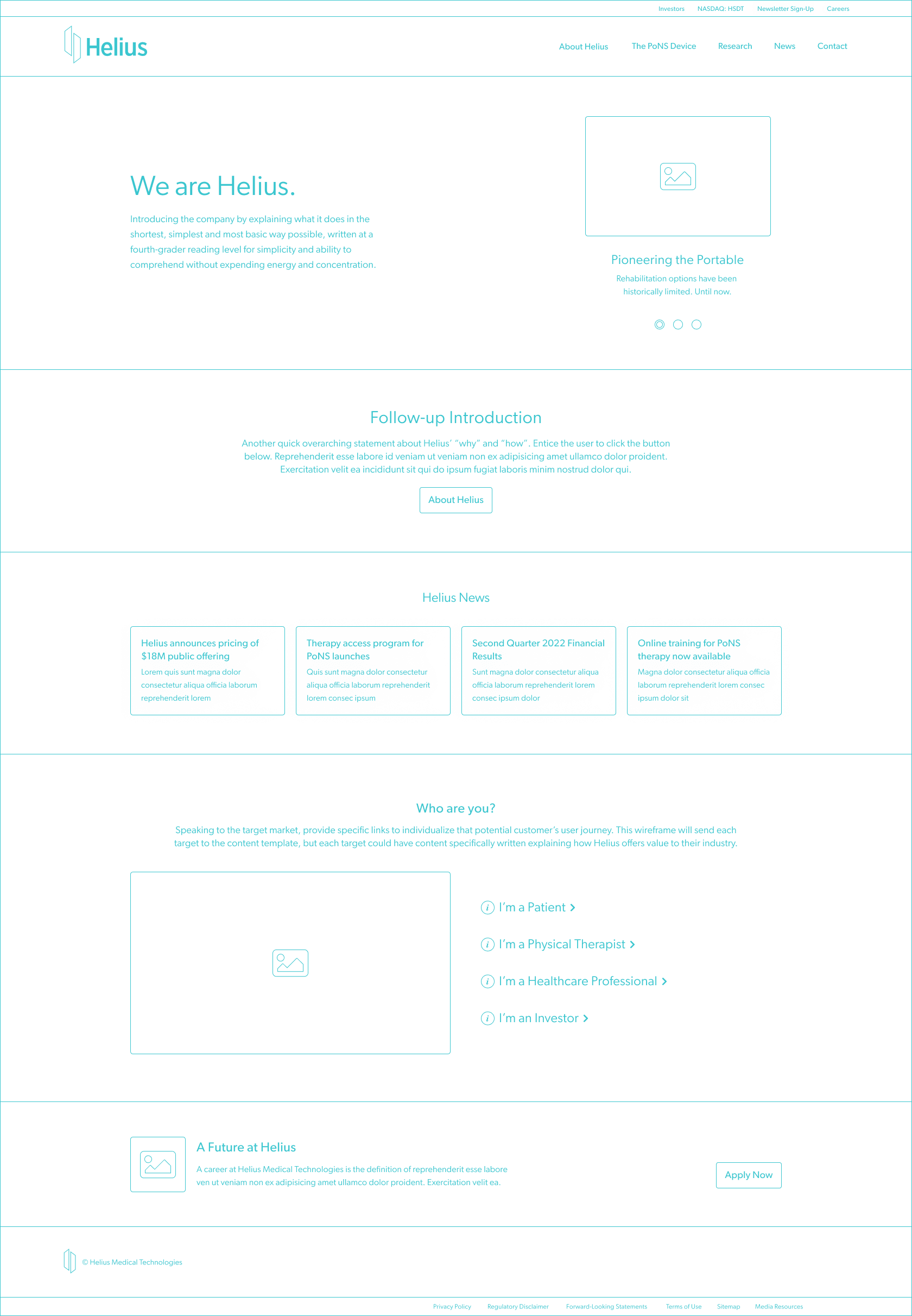
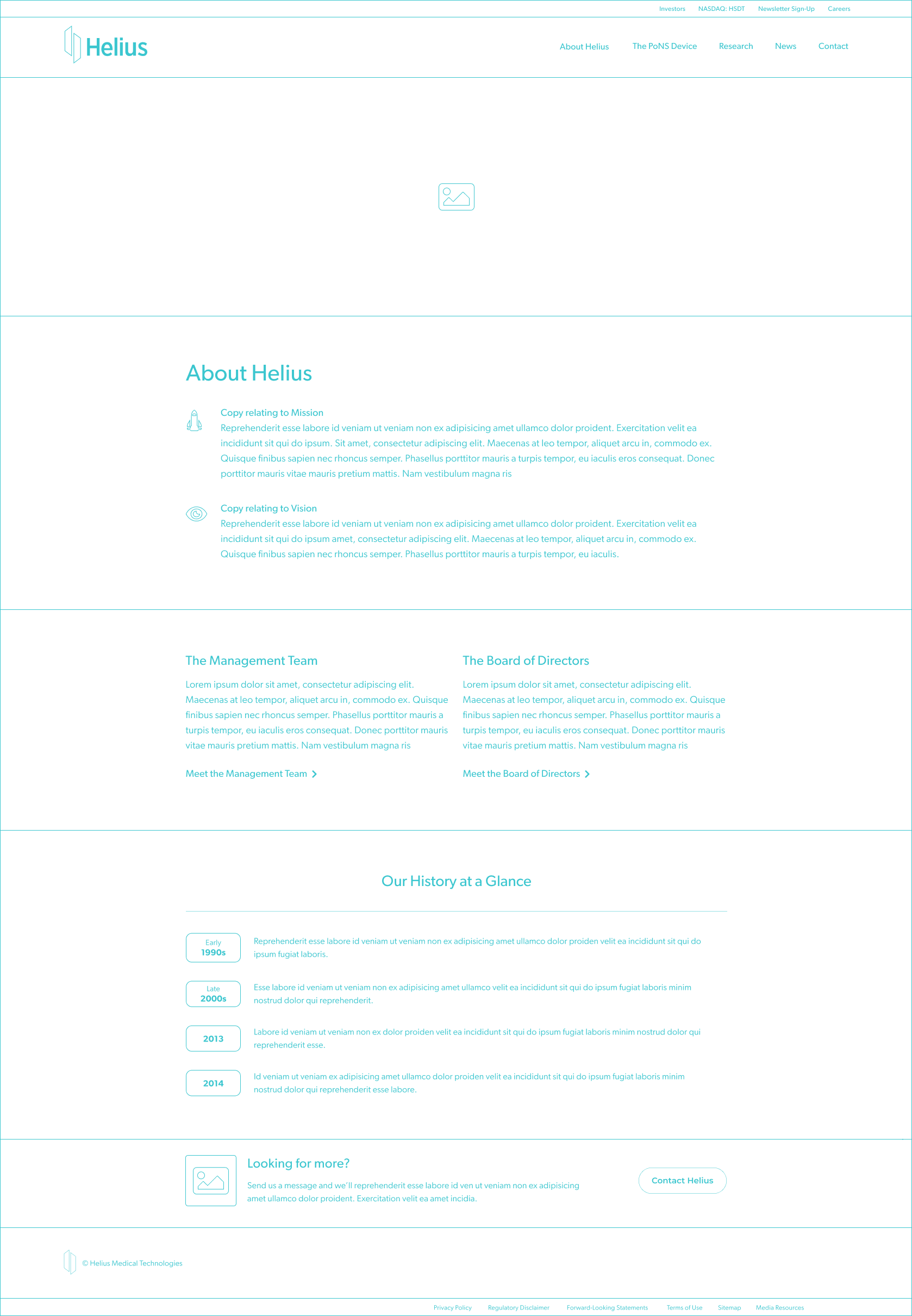
The Process
I began by mapping out the user journeys for three audiences: investors, clinicians, and prospective partners. Using this insight, I developed a modular information architecture that prioritized clarity and data accessibility. Wireframes established a clear content hierarchy, followed by high-fidelity designs in Figma that emphasized structure, contrast, and responsive adaptability.
Process Specifics

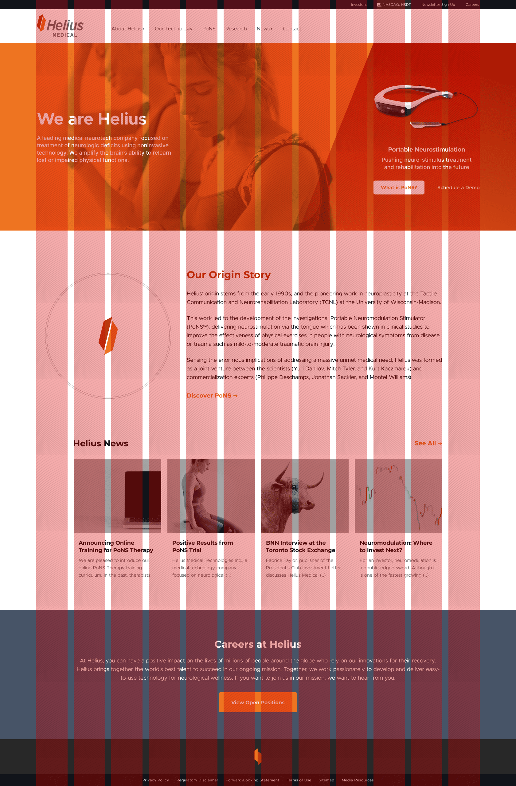
A component-based design system was introduced to ensure scalability and consistency across the site. This included a grid system that optimized for both readability and data density, reusable interface elements, and typography choices that reinforced trust and credibility.
Structured Grid
Column-based layout system used to align dense data, dashboards, and visual components while maintaining consistency and clarity across the interface.
Desktop | 12-column
Tablet | 8-column
Mobile | 4-column
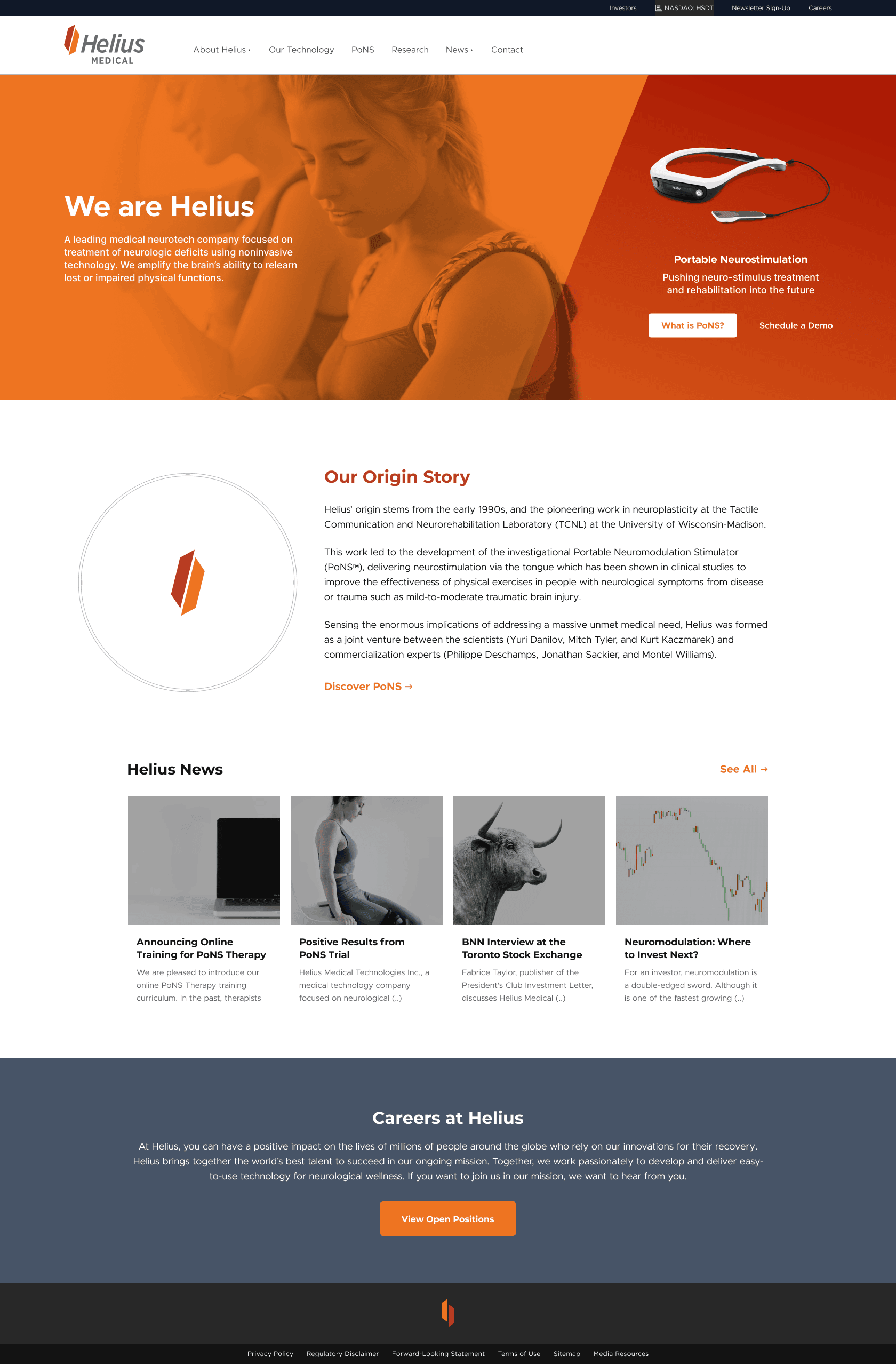
I also worked with engineering to integrate real-time API data streams for stock and press updates, ensuring accuracy while keeping performance in mind. The entire system was designed to be maintainable and future-ready, supporting additional functionality such as dashboards and clinical timelines.

Outcome
The redesign put greater focus on the product while also improving how investors access key information. Clearer navigation made complex content easier to find, and live data helped present information more openly. Flexible layouts made the site easier to update as the company evolved. The result was a modern platform that improved credibility and gave stakeholders a clearer understanding of the product and overall progress.
Retrospection
This project reinforced the value of combining precision with empathy, designing not only for accuracy but also for confidence. In highly technical industries, the experience must communicate clarity, reliability, and purpose. By uniting a structured design system with thoughtful storytelling, the Helius platform now reflects the company’s mission: to advance health through innovation that feels both human and intelligent.